Overview
In response to customer needs, we prioritized a feature that would allow users to combine data from across the platform into one screen, making it easier to visualize information and create reports.
71% of PR teams said measuring business impact is their number one challenge
64% say any form of quantifiable measurement is a top challenge.
As the first product design hire, I worked closely with the founders and the VP of Product.
Challenge
⟡ Define product hierarchy
⟡ Improve platform information architecture
⟡ Create a foundational design system
Solution
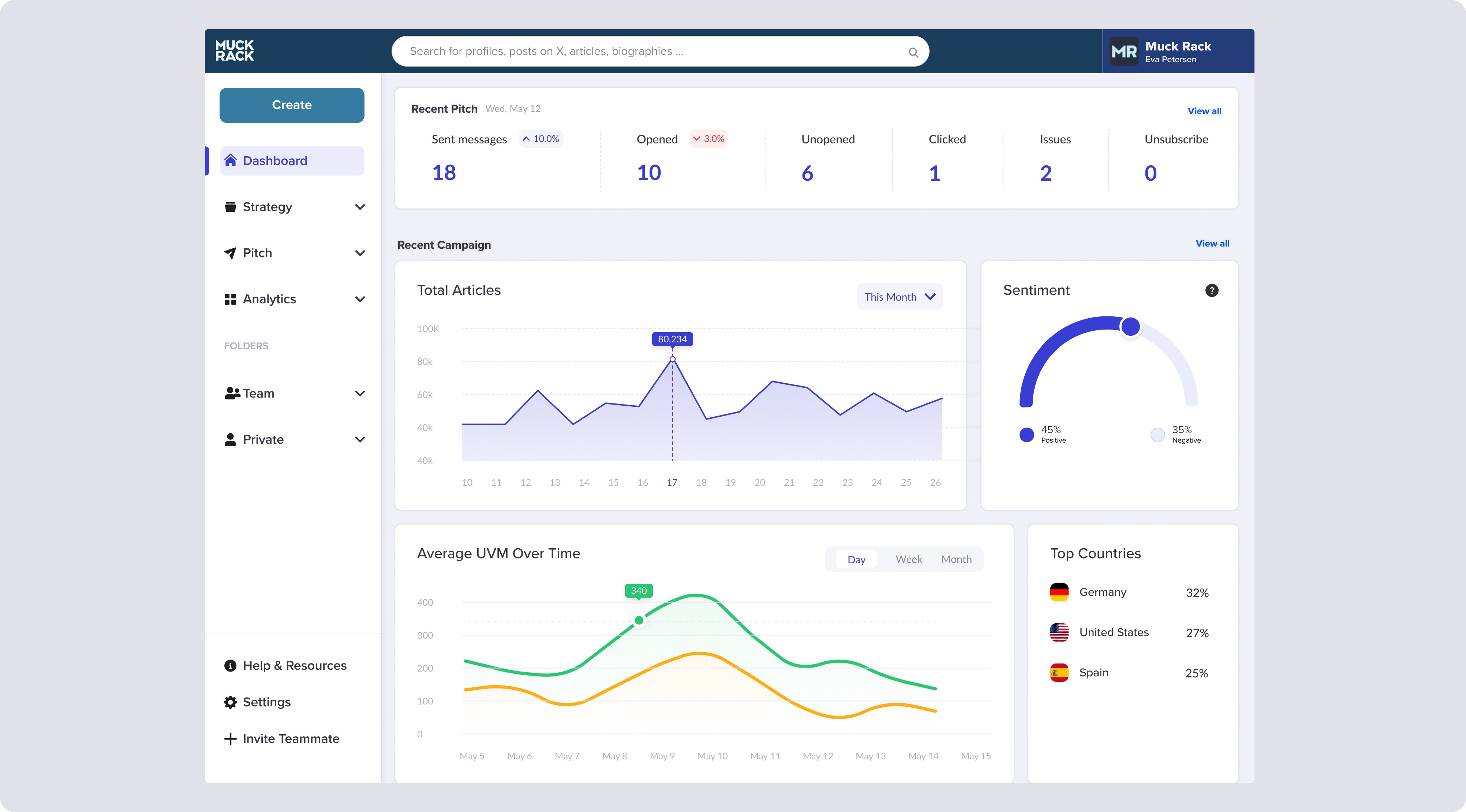
The Dashboards feature would initially include customizable widgets, such as share of voice, sentiment, unique outlets, and top authors.
This solution allowed PR teams to:
⟡ View, compile, and share key data
⟡ Produce customized executive reports
⟡ See real-time changes in how the media is covering topics
⟡ Create interactive dashboards that update in real time
Amazing job launching dashboards into beta with 100 customers! In the short term this will make us even more competitive with our biggest competitors. For the long term this sets the foundation for how we show the impact of maintaining good journalist relationships on earned media results.
—Greg Galant, CEO and co-founder (Feb 2, 2021)
My contribution
Role:
Senior product designer
Timeline:
Launch v1, Nov '20 - Feb '21
Concept v2, Mar - May '23
Tools:
Figma, FigJam and Dovetail
The team
1 × product manager
1 × product designer (me)
3 × engineers
Year
2020 - 2023
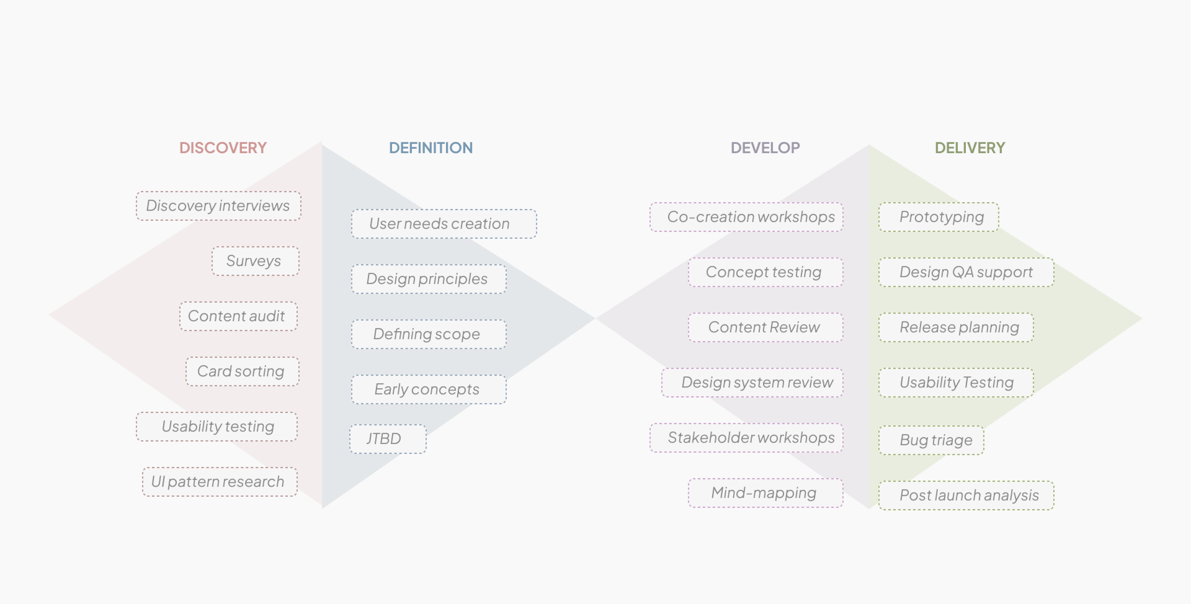
Process
Props to Eva for not only designing Dashboards over the last year but also introducing a new design process as part of this work that is already allowing us to approach features in a more collaborative and impactful way! Users are already loving how intuitive and user-friendly this feature is, and it's in very, very large part thanks to you!
—Darya Roshikina, Product Manager (Apr 7, 2021)

Discovery
Surveys
In 2020 over 1,000 PR professionals ranging from account executives at agencies to chief communications officers at major global brand were surveyed:
⟡ 64% of PR teams report that any form of quantifiable measurement is a top challenge.
⟡ 71% said measuring business impact is their number one challenge.
UI Pattern Research
Understanding user mental models, expectations and tool stack helped me design UI patterns for which users are accustomed.
Expectation: Users expect to manage all their contacts and accounts in Muck Rack.
Familiar Tools: User interviews revealed that many customers use Excel and Google as key tools in their daily workflows.
USER TOOLSTACK
MS Excel
Google Search & Gmail
MS Powerpoint
Monday.com
Brandwatch
MS Word
Mighty Scout
Definition
Jobs-To-Be-Done
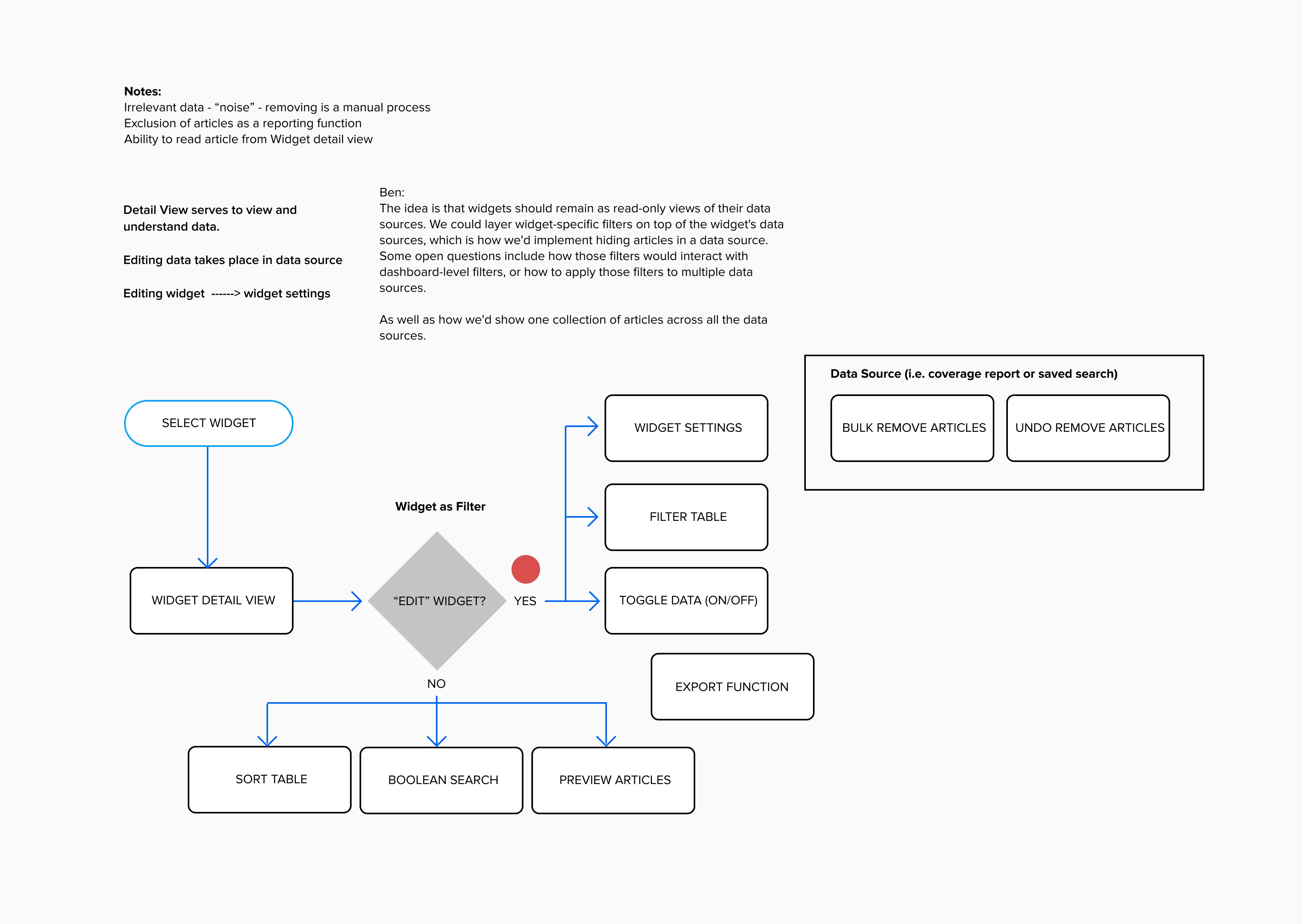
Research helped us begin to re-conceptualize what it means for users to collaborate and navigate Muck Rack based on tools and sites they already know and trust. JTBD allowed us to focus on outcomes over features.
Impact: the resulting insights helped expand the scope of this feature and beyond.
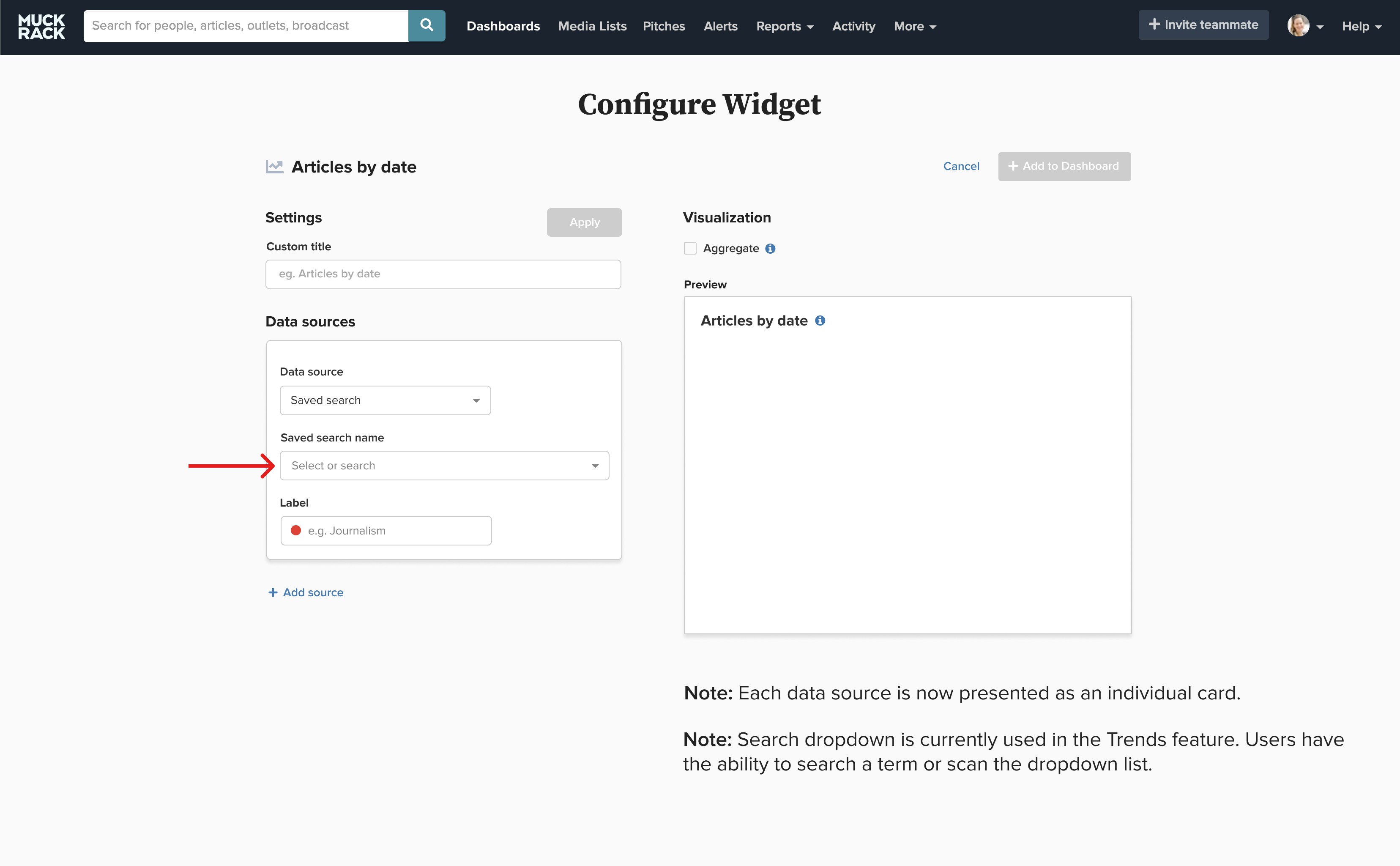
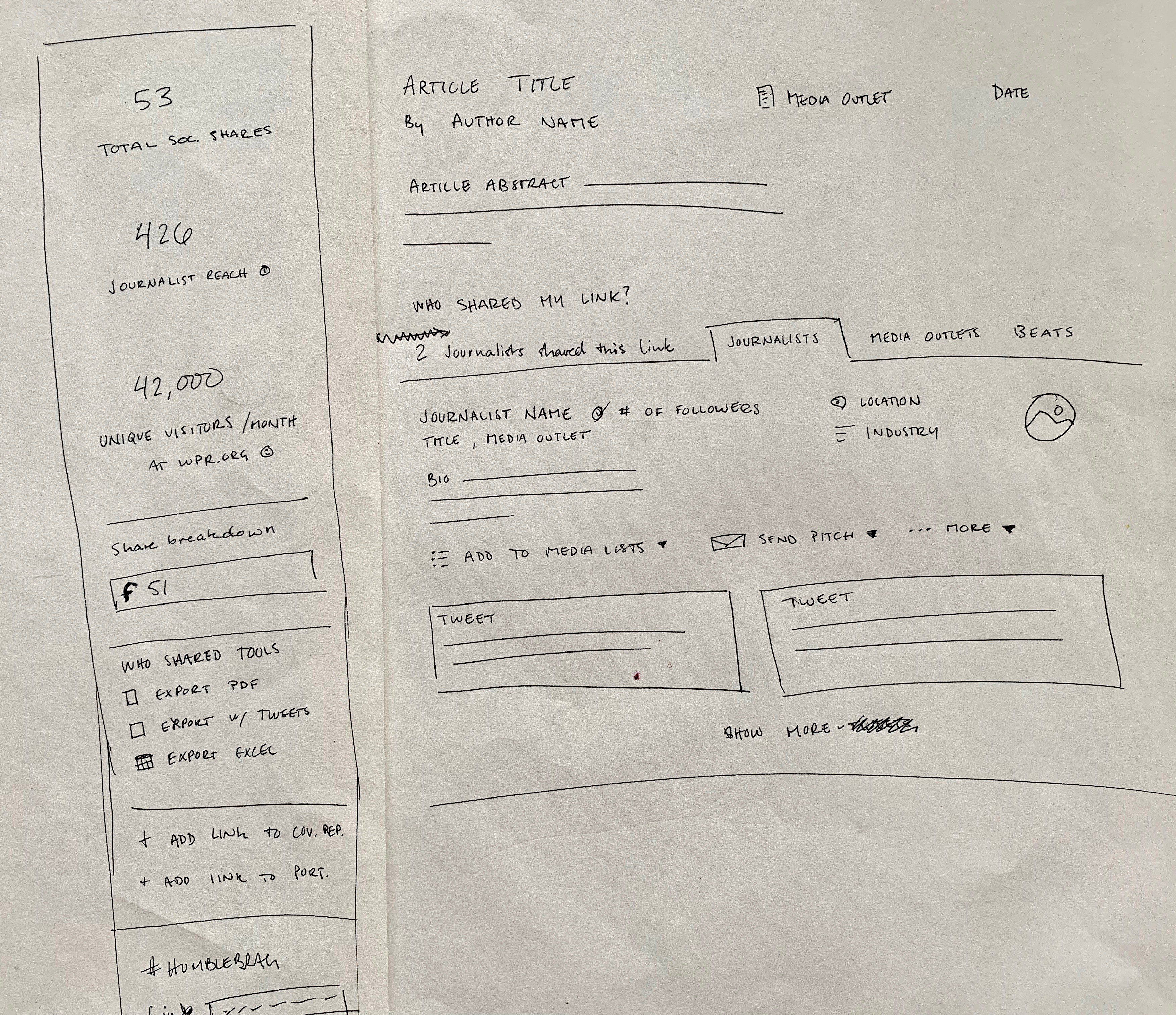
Early Concepts


Develop
Design System- Phase 1
As the product scaled and the team grew, I anticipated the need for a component based design system that would allow us to continue launching swiftly. I collaborated with Engineering, involving the CTO, to prioritize a design system that uses an edited set of brand colors to achieve consistency and convey hierarchy in an increasingly complex application. From this work, I was able to show the value of hiring a dedicated design system specialist.
Thank you for your informative presentation on the importance of Design Systems to the tech and product teams, and for your work on building Muck Rack's own design system.
—Lee Semel, CTO and co-founder (Apr 23, 2021)

GOALS
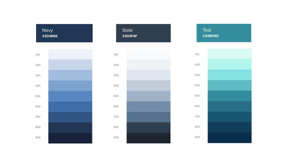
Comprehensive: The color system supports theming, data visualization, accent colors, and complex user interfaces.
Scalable: The color system can be extended with minimal disruption to existing implementations.
The primary brand colors remain in use while being supported by an extended color palette composed of a complementary and an analogous set of colors.
Props to Eva!! Great job managing all of the hidden complexities of designing dashboards, and enduring several rounds of feedback. Seeing a light at the end of the tunnel!
—Chris Bracco, Lead Engineer, Frontend (Jan 20, 2021)

Navigation Redesign
Huge props to Eva for her work on designing the new sidebar columns and updated forms! I know customers will be thrilled to see these changes and I appreciate all of the hard work you put in here!
—Darya Roshikina, Product Manager (Feb 22, 2022)
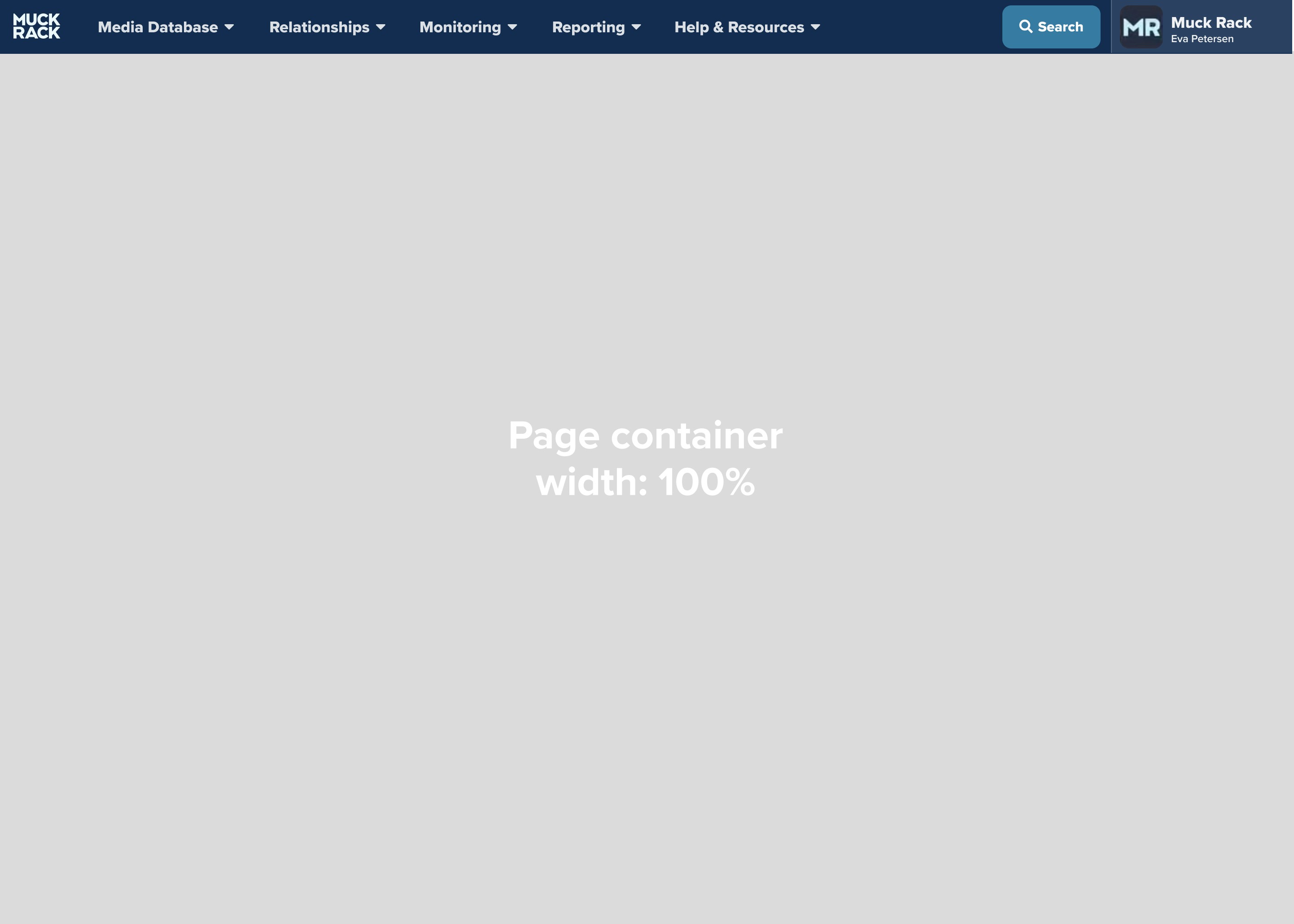
Although top navigation bars save space, there came a point when the top nav could no longer accommodate all menu items of our increasingly complex web app.
OUTCOME
Help users quickly navigate to key areas of our app and top-level collections of content, like folders
LEGACY TOP NAV

UPDATED TOP NAV
Updates to Muck Rack’s top navigation bar launched May 2023.
CONCEPT FOR V2

Deliver
MVP

Gradual UI Updates
We rolled out UI changes gradually starting with sidebars and side panels first to access settings and forms.
SIDE PANEL
Introduction of the side panel to input or edit inputs.

SIDE BAR
Introduction of the side bar to help users quickly manage top-level collections of content, like folders, and edit inputs.
Outcome
Muck Rack’s launch of Dashboards in 2021, enabled PR teams to measure success and demonstrate the value of their work to stakeholders and executives.
Additional iterations based on user research and customer feedback, led to the release of updates that make it possible for users to now see real-time changes in how the media is covering the topics they care about, compile key data and produce customized executive reports.
Ability to show impact of PR efforts
In July 2021, the team was transitioning from Cision to Muck Rack. Before Muck Rack, we could land a client in a national publication, but we couldn’t equate that coverage to dollars or show the increase in brand awareness. Now, we can say, “If you had paid for a half-page ad, it would have been $20,000."
—Maddie Caywood, Public Relations Manager at The Brand Guild
User-friendly interface
We recommend Muck Rack to other companies considering a media relations and communication platform. The user-friendly interface, comprehensive media database, and powerful analytics tools make it an invaluable asset for managing and enhancing your media outreach efforts.
—Crate & Barrel’s public relations team
My first impression of Muck Rack was, ‘Wow, this is so great and so easy to use.’ I’m not technically astute at all, and with other PR software, it feels like you have to have an IT degree. But Muck Rack was so user-friendly.
—Ellen Crane, founder of Ellen Crane APR
Business Impact
In 2022, Muck Rack hit $50M in revenue.


